The humble shop sign is often your first conversation with a potential customer. Research shows that eight out of ten people will enter a store based on its sign alone and that 65 % of consumers equate the quality of a product or service with the quality of the business signage.
Conversely, half of shoppers say that poor signage would deter them from entering a business. With so much riding on a single piece of printed marketing, your signage deserves careful planning. This guide outlines five actionable ways to improve business signs, drawing on Australian accessibility standards and research into what makes signage effective.
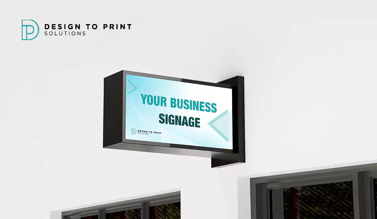
Beyond design, production quality matters. Modern digital printing has made it possible to produce vibrant, durable signs at short notice and scale. Whether you need bespoke window decals or large‑format banners, custom printing enables designs tailored to your brand and location. As an Australian company in the printing industry, Design to Print Solutions offers comprehensive printing solutions—from high‑resolution digital printing to installation services—to help businesses create signage that stands out.
Prioritise Contrast and Readability
Use high‑contrast colours
Colour contrast has a measurable effect on engagement. In a controlled study of outdoor signs, high colour contrast between the text and background increased responses by 23 %. Experts recommend dark text on a light background or light text on a dark background for maximum visibility. High contrast is especially important for people with visual impairments; accessible signage guidelines in Australia require a clear distinction between text and background and non‑reflective surfaces to avoid glare.
Choose colours that support your brand
Contrast doesn’t mean clashing colours. According to Tupp Signs, colours should align with your brand identity while remaining visually harmonious. Colour psychology can help guide this choice: blue conveys trust and professionalism while red evokes urgency or excitement. Aim for two or three colours; using too many colours creates visual clutter and reduces readability.
Use legible fonts and appropriate sizes
Australian accessibility standards specify that accessible signs should use clean, sans‑serif fonts with even stroke widths. The text size must match the viewing distance, with proper spacing and sentence case to aid readability. Upper‑case letters alone can reduce legibility; mixing upper‑ and lower‑case helps readers recognise words faster. When choosing fonts, avoid overly decorative typefaces and ensure there is sufficient contrast between the letters and the background.
Keep content organised
Contrast can also guide the reader’s eye. Use bold or contrasting colours to highlight your company name or call‑to‑action, while keeping secondary information in subtler shades. Test your signage in different lighting conditions to make sure colours remain distinguishable day and night.
Keep Your Messaging Short and Simple
In today’s fast‑moving world, people will only glance at your sign for five to ten seconds. Research on outdoor electronic signs found that short, simple messages were 20 times more effective than longer messages. Motorists and pedestrians rarely have time to read full sentences, so trim unnecessary words. For example, instead of “Are you tired?”, simply write “Tired?”.
Your call‑to‑action should also be easy to follow. When researchers asked drivers to wave versus honk, the low‑effort action (“Wave”) produced 2.5 times more engagement. Keep instructions clear, direct and low‑commitment. If you need to convey more complex information about products or services, direct customers to your website or use other marketing materials rather than cluttering your sign.
Optimise Size and Placement
Bigger signs get noticed
Size matters. The same study that examined colour contrast found that larger signs generated 75 % more engagement than smaller ones. Bigger signs are easier to read quickly, especially when they indicate your store’s location. Use larger fonts and clear spacing for critical information like your business name and directions.
Position for maximum visibility
Placement is as important as size. Signs should be installed where they can be seen from high‑traffic areas, but also at consistent heights and in predictable locations. Australian accessibility rules specify that signs must be mounted at a height accessible to all users, with unobstructed space in front of the sign to allow safe navigation. Check your sign from different angles to ensure it isn’t blocked by trees, poles or other structures. Directional signs should be located at key decision points and at eye level.
Consider lighting and environment
Placement also involves lighting conditions. Test your signage at different times of day to see how shadows, reflections and artificial light affect readability. In poorly lit areas, you may need to integrate illumination (see below) or choose lighter colours to maintain contrast. Also consider the surrounding colours—your sign should stand out against building façades or natural backgrounds.
Illuminate and Maintain Your Signage
A sign’s job does not end at sunset. Proper illumination makes your sign visible 24/7, essentially turning it into an all‑day advertising tool. Use energy‑efficient LED lighting for longevity and consistent brightness. Options include internal lighting (e.g., backlit channel letters) or external spotlights. Make sure lights don’t create glare that reduces contrast or shine into drivers’ eyes.
Maintenance is equally important. Poorly maintained signs not only convey neglect but actually drive customers away. A study cited by Flexlume found that more than 65 % of consumers judge a business’s products by the quality of its signage, and 50 % of those surveyed would avoid entering a business with poor signage. Regularly clean your signs, replace burned‑out bulbs and repair damage or fading. An outdated or broken sign undermines your brand and may even violate local regulations.
Comply with Accessibility and Regulatory Standards
Australian businesses must ensure their signage meets requirements under the Disability Discrimination Act 1992 and AS 1428.1-2021. These standards cover tactile features, braille, colour contrast, mounting heights and non‑glare finishes. Key points include:
- Clear fonts and appropriate text size – use sans‑serif fonts, sentence case and even stroke widths.
- High‑contrast colours – ensure a clear distinction between text and background to assist users with low vision.
- Tactile and braille elements – provide raised lettering and Grade 1 Braille where required.
- Consistent placement – mount signs at standard heights and near door hardware, with unobstructed space in front of them.
- Adequate lighting and non‑glare finishes – ensure signs are easily visible in all lighting conditions.
Compliance is not just a legal obligation; it also improves usability for everyone and reduces liability risks. Consider working with a signage professional who understands these standards and can help you audit existing signs and plan upgrades.
Summary Table
The table below summarises the five core tips and actions you can take to enhance your business signage. Note that many actions overlap across tips—consistency is key.
| Tip | Key focus | Practical actions |
| Contrast & readability | Make text stand out | Use high‑contrast colours, limit palette to 2–3 colours, choose clean sans‑serif fonts, size letters for viewing distance |
| Concise messaging | Communicate quickly | Keep messages to a few words, use simple calls‑to‑action (e.g., “Next Right”), avoid clutter—direct customers to other materials for more details |
| Size & placement | Ensure visibility | Use larger signs and fonts for better engagement, place signs at consistent heights, test sight lines to avoid obstructions, install directional signs at key decision points |
| Lighting & maintenance | Make signs work day and night | Integrate LED lighting, clean and repair signs regularly, replace burned‑out bulbs, and update designs when faded or outdated |
| Accessibility & compliance | Include everyone | Follow AS 1428.1‑2021: high contrast colours, tactile and braille features, correct mounting heights, non‑glare finishes and proper lighting |
Conclusion
A well‑designed sign does much more than display a name; it communicates brand values, attracts attention and invites customers through your doors. By prioritising contrast and readability, simplifying your message, optimising size and placement, ensuring proper illumination and upkeep, and meeting accessibility standards, you can turn your business signage into a powerful marketing asset. With these strategies—supported by research showing high‑contrast signs boost engagement and poorly maintained signs drive customers away—your signage will stand out in Australia’s crowded market and reflect the professionalism of your brand.
If you’re ready to bring your ideas to life, Design to Print Solutions can help. Our team specialises in digital printing, custom printing and complete printing solutions for signage, posters and more. Visit dtps.com.au to explore how our services can support your business.