
Two business cards can carry the same design, the same ink and the same size, and still feel like they came from different companies. Usually the reason is the paper. Coated or uncoated is one of the first choices you make on any print job, and it quietly decides how sharp your colours look, how the piece feels in the hand, and whether anyone can write on it.
Here is what the two actually are, how they behave differently, and how to pick the right one for the job in front of you.
What the coating actually is
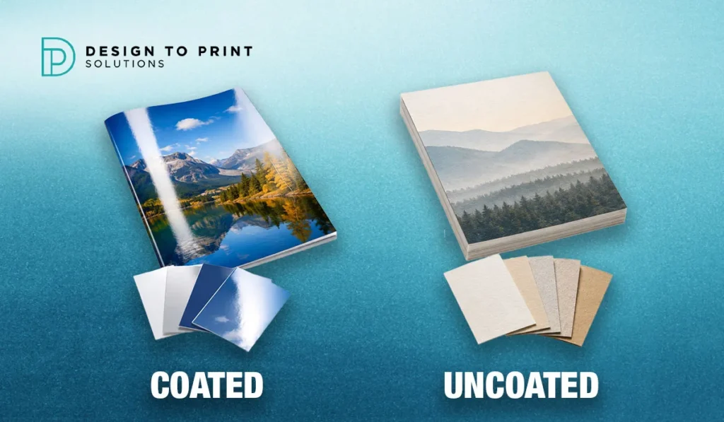
Coated paper has a thin surface layer, usually a clay or polymer compound, applied and polished during manufacturing. That layer fills the gaps between the paper fibres and creates a smooth, sealed surface.
Uncoated paper skips that step. The fibres are left exposed, so the surface is more textured, more porous, and more natural to the touch. Common uncoated stocks include bond, offset and laid papers.
This is about the paper itself, decided at the mill, not about finishes like lamination or UV that a printer might add afterwards. Those are separate choices layered on top.
The difference comes down to how ink meets the surface. On coated stock the ink largely sits on top of the sealed layer. On uncoated stock the ink soaks into the fibres. Almost everything else follows from that.
How each one behaves
Colour and sharpness. Because coated paper holds ink on the surface, colours stay vivid and edges stay crisp. Photographs and fine detail look sharper, and there is stronger contrast between the print and the white of the page, an effect printers call ink snap. On uncoated paper the ink spreads slightly as it absorbs, so colours look a touch softer and images a little more muted. That softness is not a fault. For many brands it reads as understated and refined.
Feel. Coated has a smooth, sometimes slick surface. Uncoated has warmth and texture you notice in the hand, which tends to signal authenticity and craft. The right feel depends entirely on the impression you want to leave.
Writability. This one is decisive and often forgotten. You can write on uncoated paper with a normal pen and it dries. On coated paper, especially gloss, ink from a pen tends to sit on the surface and smear. Anything meant to be written on has to be uncoated.
Durability. The coated surface resists dirt, moisture and handling better, so a coated piece stays looking clean longer. Uncoated marks and absorbs more readily.
Glare. Gloss-coated paper reflects light, which can make dense text harder to read under bright light. Uncoated has no sheen and no glare, which is why long passages of text are easier to read on it.
The finishes within “coated”
“Coated” is not a single look. It comes in a range of sheens:
- Gloss is the shiniest, with the strongest colour pop. It suits image-heavy pieces like flyers and posters where you want maximum vibrancy.
- Silk and satin sit in the middle, with a soft sheen and less glare than gloss. They feel more refined and keep colours rich, which makes them popular for premium brochures and menus.
- Matte coated gives you the ink control and durability of a coating without the shine, so text stays easy to read while still looking finished.
If you like vivid colour but dislike glare, a silk or matte coating is often the sweet spot.
Which to choose, product by product
Rather than memorise rules, match the paper to what the piece has to do.
Business cards. Either works, and the choice sets the tone. Coated (often with a matte or soft-touch laminate) gives crisp colour and a durable card. Uncoated gives a natural, tactile feel that many premium and design-led brands prefer. Our guide on choosing a business card finish goes deeper on this exact decision.
Brochures and flyers. Usually coated. These lean on colour and photography, and a gloss or silk stock makes them pop while standing up to handling. See our companion guide on brochure folds once you have settled on stock.
Letterheads and envelopes. Uncoated, almost always. They need to take pen and printer ink, and an uncoated stock also feels more corporate and understated. Coated letterhead would smear the moment someone signs it.
Notepads, NCR books and forms. Uncoated, without exception. Every one of these is designed to be written on, so a coated surface would defeat the purpose. This applies to notepads and NCR invoice books alike.
Menus. Depends on the venue. A busy cafe menu that gets wiped down wants a durable coated or laminated stock. An upscale restaurant chasing a tactile, premium feel might choose uncoated.
Presentation folders and catalogues. Usually coated for the colour and durability, though an uncoated cover can feel distinctly high-end.
Paper weight (GSM), and why it matters as much as coating
Coating decides the surface; GSM decides the substance. GSM (grams per square metre) measures how heavy and thick a stock is, and it shapes the impression as much as the finish does. A flimsy business card undercuts even the best design, while a card with real weight in the hand signals quality before anyone reads a word.
As a rough Australian guide, letterheads and the inside pages of booklets sit around the lighter text weights, flyers and brochure pages fall in the mid-range, and business cards, postcards and covers move up into the heavier card stocks. Coating and weight are independent choices: you can pair a light stock with a coating or leave a heavy card uncoated. Your printer will recommend a weight that suits the product and the budget, and it is always worth feeling a sample at the weight you are considering rather than choosing a number off a page.
Mill coating versus laminate
It helps to separate two things that both get loosely called “coating.” One is the mill coating baked into the paper during manufacturing, which is what this guide is about. The other is a laminate or varnish a printer applies after printing, such as a matte or gloss laminate on a business card, or a soft-touch coating that feels like suede. These are different decisions. You can print on an uncoated stock and still add a laminate on top, which is how some cards achieve a natural paper base with a protective, tactile surface.
This is also why uncoated paper is often the better base for embossing, debossing and foil stamping. The texture gives those tactile finishes more contrast than a slick coated surface does. So “premium” does not automatically mean coated: a heavy uncoated card with a foil logo can feel more luxurious than any gloss.
What about cost?
Coating on its own is rarely the biggest lever on price. Quantity, paper weight and any finishing such as lamination, foiling or spot UV usually move the quote more than the choice of coated versus uncoated stock. Ordering in larger quantities brings the unit cost down, and a mid-weight coated stock is often no dearer than a comparable uncoated one. If budget is tight, decide what the piece has to do first, then let your printer suggest the stock that meets that brief at the right price, rather than defaulting to the cheapest option and regretting the feel later.
Quick reference
When you need to choose quickly, this covers the common jobs:
- Coated (gloss, silk, satin or matte): flyers, brochures, posters, catalogues, presentation folders and any photo-heavy, colour-rich piece
- Uncoated: letterheads, envelopes, notepads, NCR books, forms, resumes and anything written on or read at length
- Either, by preference: business cards and menus, where the feel you are after decides it between a crisp coated card stock and a natural, tactile uncoated one
The simplest way to decide
If the piece is meant to be looked at, colour-rich, or handled a lot, lean coated. If it is meant to be written on, read at length, or felt in the hand, lean uncoated. When it genuinely could go either way, the deciding factor is the feeling you want to leave the reader with.
And when a description on a screen is not enough, ask for a sample. Paper is a physical thing, and the fastest way to choose is to hold both. Design to Print Solutions carries a range of coated and uncoated stocks and can put samples in your hands before you commit, so you are choosing on feel rather than a guess. If your artwork is not print-ready yet, our guide on file formats printers need will help you prepare it.
Choosing the right stock costs nothing extra and lifts the whole job. Request a quote or a sample and tell us what you are printing.
Frequently asked questions
What is the difference between coated and uncoated paper?
Coated paper has a sealed surface layer applied at the mill, so ink sits on top and colours stay sharp and vivid. Uncoated paper has no coating, so it is more textured and absorbs ink, giving a softer look and a natural feel you can write on.
Can you write on coated paper?
Not reliably. On coated stock, especially gloss, pen ink tends to sit on the surface and smear rather than dry. For anything you need to write on, such as letterheads, forms or notepads, choose uncoated paper.
Which is better for business cards, coated or uncoated?
Both work and it comes down to the impression you want. Coated cards give crisp colour and durability, while uncoated cards feel natural and tactile, which many premium brands prefer. Uncoated is also the better base for foil or embossing.
Is uncoated paper cheaper than coated?
Cost depends more on weight, quantity and finish than on the coating alone, so neither is automatically cheaper. Ask your printer for a quote on the specific stock and weight you are considering.
Does uncoated paper look cheap?
No. Uncoated is often chosen for premium, design-led and eco-minded brands precisely because its texture reads as authentic and refined. Paired with a foil or embossed detail, a heavy uncoated stock can feel more luxurious than gloss.
Which paper is best for brochures and flyers?
Usually coated. Brochures and flyers rely on colour and photography, and a gloss or silk coated stock keeps the images vivid while standing up to handling. Choose matte or silk if you want the colour without heavy glare.
