
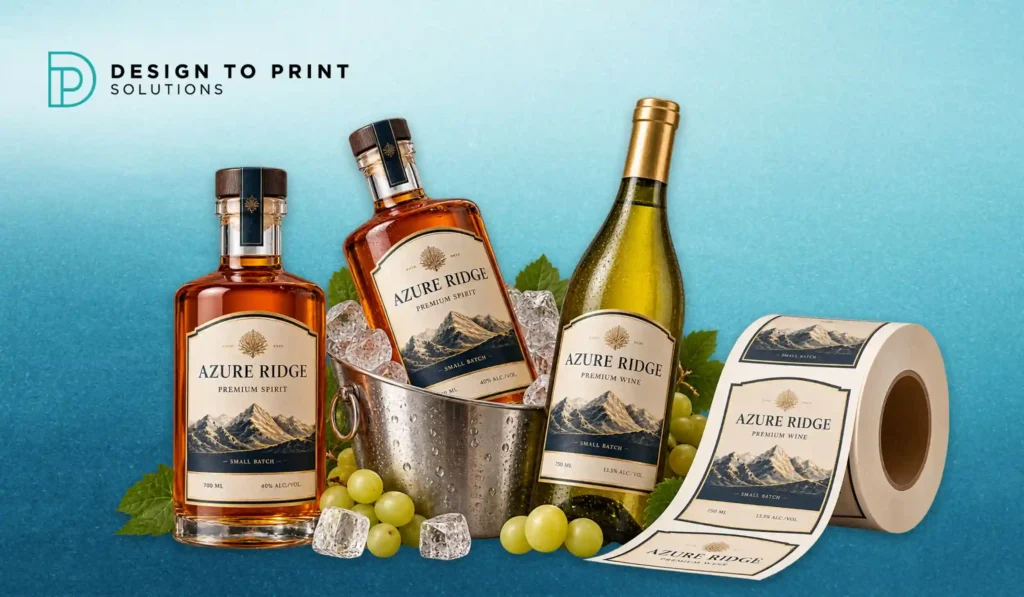
Wine and spirit label printing is judged twice. First on the shelf, where the stock, the foil and the texture decide whether a hand reaches for your bottle or the one beside it. Then an hour later, in an ice bucket at a restaurant table, where that same label either holds its shape or turns into a wrinkled, lifting mess in front of the people you most wanted to impress.
Plenty of beautiful labels fail the second test. A textured cotton stock that photographs perfectly in the studio can cockle within twenty minutes of sitting in iced water. A gorgeous matt black label can scuff grey along every edge in transit. These are not design failures, they are specification failures, and they are entirely avoidable if the face stock, adhesive and finish are chosen for the way the bottle will actually be handled.
This guide covers what breaks down in the bucket, how to choose stocks and finishes for Australian conditions, the compliance elements that have to fit on the label regardless, and how to test a specification before committing to a production run.
What Actually Goes Wrong in the Ice Bucket
Four failures account for most complaints.
Water absorption and cockling. Uncoated and textured papers absorb moisture, expand unevenly and ripple. The bottle looks tired even though the wine inside is fine.
Edge lift. Chilled glass develops condensation, and a bottle that is already cold when the label is applied gives the adhesive almost nothing to bond with. The corners curl first, then the whole label releases.
Ink and coating scuff. Bottles rub against each other in cartons, in fridges and in the bucket. Dark solids and matt finishes show scuffing far more than light or gloss surfaces.
Adhesive bleed. The wrong adhesive on a thin, translucent stock can show through as a shadow or a halo once it is wet, particularly on clear films.
Knowing which of these matters most for your product is the first decision. A sparkling or white wine lives in ice. A gin bottle lives in a freezer and comes out sweating. A cellar door red may never get cold at all, but it will spend two years in storage and travel in a carton.
Face Stocks: Choosing the Right Starting Point
Textured and Uncoated Papers
Textured stocks, felt marks, laid finishes and heavier cotton papers carry the premium cues most wine brands want. They take embossing and foil beautifully and feel considered in the hand.
The trade off is moisture performance. Standard uncoated papers are the wrong choice for anything that is chilled or served in ice unless they are specified with wet strength properties. For cellar door exclusives, library releases and reds that stay at ambient temperature, they are an excellent choice.
Wet-Strength Papers
Wet-strength papers are the workhorse of the wine category for good reason. They look and feel like a traditional uncoated or lightly textured paper, but the fibre is treated so the sheet holds its structure when saturated. A bottle can sit in a bucket through a long lunch and come out with the label intact and still legible.
If your product is a white, rosé, sparkling or anything a sommelier will plunge into ice, this is generally the default specification to start from.
Clear and White Films
Polypropylene films are the natural fit for gin, vodka, premium RTDs and modern spirit brands. Clear film gives the no-label look that lets the liquid and the bottle shape carry the design, and white film gives a crisp, durable base with excellent water resistance.
Films handle condensation and freezer storage far better than paper. The design considerations are different though: clear film almost always needs a white ink underprint behind any solid colour or text, otherwise the liquid behind the label changes how the artwork reads, and a gin that is clear in the bottle and amber in a barrel-aged release will look like two different brands on the same artwork.
Metallised and Specialty Stocks
Metallised papers and films give an all-over reflective base without the cost of stamping foil across a large area. They suit sparkling, premium spirits and limited releases. Keep contrast in mind for any mandatory text, because small print on a reflective surface can become genuinely hard to read under warm restaurant lighting.
Adhesive Is Half the Decision
Face stock gets the attention and adhesive causes the failures. Three questions decide it.
At what temperature is the label applied? Standard permanent adhesives need application to a dry bottle at room temperature. If you are labelling chilled or refrigerated stock, you need an adhesive rated for cold application, otherwise initial bond will be poor and edges will lift later.
What happens to the bottle afterwards? Ice bucket immersion, freezer storage, chilled transport and humid Melbourne summers all put the bond under load. A general purpose permanent adhesive is not the same as a wet-apply or ice bucket rated adhesive.
Is the glass clean and dry? Residue from washing, release agents on new glass and condensation from a cool room all reduce adhesion. Many small batch producers blame the label when the real issue is a bottle that was not at ambient temperature when it went through the applicator.
For products that will be returned, refilled or relabelled, removable adhesives exist, but they should be a deliberate choice rather than a default, because they will not hold through immersion.
Finishes That Protect as Well as Decorate
Laminates give the strongest protection against scuffing and moisture. Gloss laminate is the most durable, matt laminate looks more premium but marks more easily, and soft touch laminate delivers the tactile, velvety feel that works well on spirits while remaining quite scuff sensitive on large dark areas.
Varnishes, applied in line, protect the ink without adding the plastic layer of a laminate. Spot varnish or spot UV over a matt base creates contrast that catches shelf lighting, highlighting a crest, a botanical illustration or a vintage.
Foil stamping remains the clearest premium signal in the category. Hot foil pressed into a textured stock gives depth that printed metallic ink cannot replicate. Cold foil suits larger coverage and finer detail across longer runs.
Embossing and debossing add dimension that survives everything, because the effect is structural rather than printed. A blind embossed crest on a wet strength stock still reads after an hour in ice.
A practical combination that performs well for chilled wine: wet strength face stock, cold apply permanent adhesive, matt varnish over the body with hot foil on the brand mark and a blind emboss on the crest.
Compliance Still Has to Fit
Decoration decisions have to leave room for mandatory information. Australian alcohol labels generally need the name or description of the product, alcohol by volume, the number of standard drinks, the pregnancy warning label in its prescribed form, colours and sizes, allergen declarations including added sulphites where applicable, lot identification, the supplier’s name and street address, country of origin and net volume.
There is also a change on the horizon worth designing for now. Changes to the Food Standards Code mandating an energy statement on packaged alcoholic beverages were gazetted in August 2025, with a three year transition, meaning most products will need a compliant energy statement from August 2028. Beverages that already carry a nutrition information panel are exempt. If you are investing in dies, foil blocks and a long artwork cycle, leave space on the back label now so the addition is a text update rather than a redesign.
Our team checks supplied files before production for the practical issues that affect printability, such as missing bleed, low resolution artwork, RGB colour and text set too small to hold on a textured stock. Confirming that your label content satisfies the Code and the pregnancy warning requirements remains your responsibility or your compliance adviser’s, so build that check into your approval process before the proof is signed.
Test the Specification Before You Print the Run
Four tests take a day and save a production run.
The soak test. Apply the proof to a filled bottle, leave it in iced water for an hour, then check edges, surface and legibility.
The chill test. Put the labelled bottle in the fridge overnight, bring it out, let it sweat and see how the adhesive behaves through a full condensation cycle.
The scuff test. Rub two labelled bottles together and check the dark areas and foil edges.
The lighting test. Look at the label under warm restaurant light and under cool retail light. Metallics and low contrast type often fail here, not on the proof sheet.
At Design to Print Solutions (DTPS), we print short and medium run labels for drinks producers across Melbourne and the Mornington Peninsula, which makes it practical to test a specification on a small batch before committing to a season’s production.
Preparing Label Artwork for Press
Build files in CMYK with 3mm bleed and keep all critical content, including mandatory text and lot code areas, at least 4mm inside the trim. Supply dielines as a separate layer rather than printing elements. Specify foil, emboss and spot varnish as named spot colour layers set to overprint, so the finishing areas are unambiguous.
For clear film, supply the white underprint as its own layer. Set the nutrition or energy statement and warning text as live vector type rather than placed images, so it stays crisp at small sizes. If the label wraps a curved bottle, allow for distortion at the leading and trailing edges and avoid placing fine registration dependent detail there.
Beyond the bottle itself, most drinks brands end up needing a matched set: swing tags for gift packs, printed packaging boxes for direct to consumer shipping, beer coasters and menus for cellar door and venue accounts, and custom stickers for vintage updates, awards and limited release overlays. Labels on rolls suit machine application and volume production, while label sheets work for hand applied small batches and trial runs.
Send through your bottle type, product, how it will be stored and served, and your artwork or dieline, and we will come back with an itemised quote and a recommended stock, adhesive and finish combination for the job. Request a free quote or browse our printing services and recent work.
Frequently Asked Questions
What label stock is best for wine that goes in an ice bucket?
A wet-strength paper is the usual choice. It keeps the traditional uncoated or textured look most wine brands want, but the fibre is treated to hold its structure when saturated, so the label does not ripple or disintegrate after an hour in iced water. Standard uncoated paper without wet-strength properties should be avoided for anything served chilled.
Why do my labels lift at the corners after refrigeration?
This is usually an adhesive and application temperature issue rather than a stock issue. Applying labels to cold or damp bottles, or using a standard permanent adhesive on product that will be chilled, gives a weak initial bond that fails once condensation forms. A cold-apply or wet-apply rated adhesive, with bottles at ambient temperature and dry at application, solves most cases.
Should I use clear film or paper for a gin or vodka label?
Clear polypropylene film suits spirits because it resists condensation and freezer storage, and gives the no-label look that showcases the bottle. It needs a white ink underprint behind solid colours and text so the artwork reads consistently. Paper stocks still work for spirits, but for a bottle that lives in a freezer, film is the safer specification.
Does a matt black label scuff more than a gloss one?
Yes. Dark solids and matt surfaces show rub marks far more readily than light or gloss finishes, and the damage appears along edges and high points first. A gloss or soft-touch laminate, or a protective varnish, reduces it, and keeping heavy dark coverage away from the outer edges of the label helps further.
What has to appear on an Australian alcohol label?
Generally the product name, alcohol by volume, standard drinks, the pregnancy warning label in its prescribed form, allergen declarations including added sulphites where relevant, lot identification, supplier name and street address, country of origin and net volume. Changes gazetted in August 2025 also introduce a mandatory energy statement for most packaged alcoholic beverages, with a three year transition period. Confirm specific obligations with your compliance adviser or regulator.
Can I print a small run of labels for a limited release?
Yes. Short run digital label printing suits limited releases, single vineyard bottlings, seasonal variants and trial batches, and lets you test a stock, adhesive and finish combination on a small quantity before scaling up to a full production run.
