
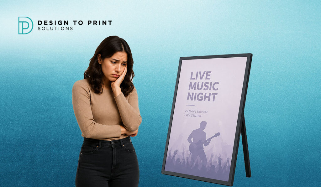
You invested in a print run. You put your poster in the window, pinned it to the noticeboard, or stuck it to the hoarding — and nothing happened. No calls. No clicks. No noticeable foot traffic increase. The poster is there, but nobody seems to notice it.
This is one of the most common and quietly frustrating experiences in print marketing, and it happens to Melbourne businesses of all sizes every single day — from a café on Lygon Street in Carlton to a retail shop in Glen Waverley, a tradie business in Dandenong, or a tourism operator in Mornington. The poster exists. It is just not working.
The good news is that a forgettable, ignored poster is almost never the result of bad luck. It is the result of a handful of specific, identifiable, and completely fixable mistakes — in design, in print quality, in placement, or in all three. This guide breaks down every one of those mistakes and gives you a clear, practical fix for each one.
The Hard Truth About Poster Visibility in Melbourne
Melbourne is one of Australia’s most visually competitive cities. The streets of Fitzroy, Collingwood, Brunswick, South Yarra, and the Melbourne CBD are saturated with printed and digital signage competing for exactly the same slice of pedestrian attention. On the Mornington Peninsula — from Mornington’s main strip through to Rosebud, Rye, and Hastings — seasonal foot traffic creates intense visual competition for tourism, hospitality, and retail businesses during peak periods.
In this environment, a poster that is merely present is not enough. It has to earn attention in two to three seconds from a person in motion, in changing light conditions, often surrounded by other visual noise. Most posters fail that test before they are even printed, because the problems are built into the design before a single sheet rolls off the press.
Here is exactly where things go wrong — and what to do about it.
Mistake 1 — Your Headline Is Too Small to Read from a Distance
This is the single most common reason posters get ignored in Melbourne streetscapes and retail environments. The headline — your most important piece of communication — is physically too small to be read by a person walking past at normal pace, or standing more than one to two metres away.
Walk to the other side of the room and look at your poster design. Better yet, stand three to four metres away from your screen with the design open. Can you read the headline instantly? If you have to squint, step forward, or concentrate — it is too small.
The Fix:
Your poster headline must be legible from the furthest realistic viewing distance your audience will experience. For an A3 noticeboard poster, that might be one to two metres. For an A1 retail window poster on Chapel Street or Lygon Street, it needs to be readable from the footpath — four to six metres away. For an A0 hoarding on a construction site, it must read clearly from across a street.
As a practical rule: on an A1 poster, your primary headline should be no smaller than 80–100 pt. On A0, you are looking at 120 pt and above. When in doubt, make it bigger. There is no such thing as a headline that is too easy to read at a distance.
Mistake 2 — You Are Trying to Say Too Many Things at Once
This is the design equivalent of a person at a networking event who tries to tell you everything about themselves in the first 30 seconds. The result is that you retain nothing.
Melbourne businesses frequently fall into this trap because posters feel like expensive real estate — and the instinct is to fill every available centimetre with information. Opening hours, phone number, website, QR code, social media handles, a list of services, a price comparison, a testimonial, an offer, and a slogan — all on one A2 poster. The result is a visual wall that a passing pedestrian’s brain simply refuses to engage with.
The Fix:
One poster, one message. Decide on the single most important thing you want your audience to do or understand — and design the entire poster around that one thing. Everything else is secondary, and secondary information should either be removed entirely or reduced to supporting detail in a much smaller font below your primary message.
Ask yourself: if someone could only read one line of this poster before looking away, what do I want that line to be? That is your headline. That is the only thing that matters on this poster.
For businesses running campaigns with multiple messages, the answer is not to cram them onto one poster — it is to run multiple targeted posters, each with a single clear message, through a well-planned poster printing campaign across your target Melbourne suburb.
Mistake 3 — Your Colour Contrast Is Too Low
Colour is the first thing the human brain processes when scanning an environment for visual information. Before your audience reads a single word, their brain has already decided whether your poster is worth stopping for — based almost entirely on colour and contrast.
Low-contrast posters — light text on a light background, mid-grey on off-white, soft pastels on cream — are the visual equivalent of whispering in a loud room. They are simply not visible from the distances and in the lighting conditions that Melbourne’s retail and outdoor environments demand.
This problem is particularly severe in Melbourne’s outdoor environments and Peninsula coastal locations. Direct summer sunlight washes out low-contrast designs completely. On a bright January day in Safety Beach, Rye, or Mornington’s foreshore strip, a poster with soft, muted tones may as well be invisible.
The Fix:
Use bold, high-contrast colour combinations. Dark text on a light background, or light text on a dark background, is the foundation of readable poster design. The strongest contrast combination available — black text on white, or white text on black — remains the most effective for pure legibility, even if it is not always the most visually exciting.
If you want colour in your poster design, use it deliberately. A strong block of accent colour behind your headline, or a high-contrast border framing your key message, creates visual impact without sacrificing legibility. Test your design in greyscale — if it still reads clearly in black and white, the contrast is strong enough for full-colour print.
Mistake 4 — The Print Quality Does Not Match the Design Quality
You can have a brilliant design and still produce a forgettable poster if the print quality lets it down. Faded colours, blurry images, muddy blacks, and uneven ink coverage all signal to the viewer — on a subconscious level — that the business behind the poster does not take its presentation seriously.
This is a problem that particularly affects businesses using consumer inkjet printers, low-cost online-only print factories with no local quality control, or desktop printers that are simply not capable of reproducing professional colour accuracy at large formats. An A1 poster printed on an office inkjet at 72 DPI will look dramatically different from the same design produced on a professional large-format press at 300 DPI — even if the design file is identical.
The Fix:
Work with a professional local printer who uses calibrated, high-resolution digital press equipment. At DTPS, every poster print job runs on professional-grade CMYK digital presses with colour calibration and quality checking at every stage of production — not the kind of result you can achieve on a consumer printer or through an automated online print factory with no local oversight.
Equally important: submit your artwork correctly. Your design file must be:
- 300 DPI at the final print size — not scaled up from a smaller file
- CMYK colour mode — not RGB, which will shift colours when converted at press
- 3 mm bleed on all four sides — to prevent white edges after trimming
- All fonts embedded or outlined — to prevent substitution by the printer’s system
If your file is not print-ready, even the best press in Melbourne will produce a disappointing result. Our team checks every file before it goes to press and flags any technical issues — so you are never caught by a problem after the job is printed.
Mistake 5 — You Chose the Wrong Size for Your Display Location
Size is not just about budget — it is about the physics of visibility. A poster that is perfectly appropriate for one location is completely invisible in another. An A3 poster pinned to a community noticeboard that sits at eye level, 50 cm from the viewer, works beautifully. That exact same A3 poster placed in a retail window on a busy Melbourne CBD street, viewed from the footpath four metres away, simply does not register.
The reverse problem also exists. Businesses occasionally print A0 or large-format posters for environments where a smaller format would have been more appropriate — a cramped café wall, a small shop window, or an indoor corridor where the display area is simply not big enough to accommodate the format. A poster that is too large for its frame or display location looks unprofessional and can create a visual overcrowding effect that drives attention away.
The Fix:
Match your poster size to its display environment before you brief your printer. The standard paper size guide gives you the dimensions for every A-series size, but the practical test is simpler: measure the available display space, estimate the typical viewing distance, and choose the largest format that fits comfortably within those constraints.
For most Melbourne street-facing retail window applications, A1 (594 × 841 mm) is the sweet spot — large enough for strong street visibility without overwhelming a standard shopfront window frame. For trade shows, expos, and building hoardings, A0 delivers the scale required for maximum visibility at distance.
Mistake 6 — You Used Too Many Fonts
Typography is one of the most immediately legible signals of brand quality in any printed material. A poster that uses three, four, or five different typefaces simultaneously communicates visual chaos — and chaos does not build trust or interest.
This is a mistake that occurs most often when businesses design their own posters in tools like Canva or Microsoft Word, where accessing dozens of fonts is a single click away. The temptation to mix and match is understandable but almost always produces a design that looks inconsistent, amateur, and visually overwhelming.
The Fix:
Limit yourself to two typefaces per poster — a maximum. One strong, bold display font for your headline and one clean, readable body font for supporting information. These two fonts should complement each other in weight and character, and both should be chosen with legibility at print scale as the primary criterion — not aesthetic novelty.
If you are not confident in your typography choices, our in-house design team at DTPS creates poster artwork from scratch, working from your brand guidelines, logo, and campaign brief to produce a typographically cohesive design that looks professional at every print size from A3 through to A0.
Mistake 7 — There Is No Clear Call to Action
A poster without a call to action is a missed opportunity. You have captured someone’s attention, communicated your message — and then left them with nothing to do next. No next step, no action prompted, no conversion possible.
This happens more often than you might expect. Beautifully designed event posters with no website or ticketing link. Retail sale posters with no phone number or in-store direction. Property development hoardings with no QR code, URL, or enquiry number. The poster does the job of attracting attention and then fails at the final step.
The Fix:
Every poster needs one clear, unmissable call to action. Decide what you want your audience to do next — and make that action as easy as possible to take. Options include:
- A dynamic QR code that links to a landing page, booking form, or online store (recommended for campaigns where measuring results matters)
- A phone number in large, bold type that is readable from the viewing distance
- A clear, short website URL — avoid long URLs with random characters that cannot be memorised or typed easily
- A physical address and a compelling reason to visit — open hours, a specific offer, a named promotion
For event posters, include your ticketing platform URL or QR code prominently. For retail campaigns across busy Melbourne precincts like Carlton, Dandenong, and Melbourne CBD, a QR code linked to your Google Business listing or current offer page creates a measurable, trackable bridge between your print campaign and your digital presence.
Mistake 8 — Your Poster Is in the Wrong Location
Even a technically perfect, beautifully designed, professionally printed poster will produce no results if it is placed where your target audience never goes. Location and audience match is as critical as design quality — and it is one of the most frequently overlooked factors in poster campaign planning.
A hospitality business in Southbank placing posters in Dandenong community centres is not reaching its audience. A tradie in Werribee placing posters at CBD corporate office buildings is wasting print budget. A Mornington Peninsula tourism business placing posters in Preston is missing the people most likely to respond to their offer.
The Fix:
Before printing, map your target audience’s movements. Where do they work? Where do they shop? Where do they socialise? What cafés, gyms, community boards, and noticeboards do they pass on a regular basis? Place your posters at the intersections of those movement patterns — not at locations that simply feel convenient.
For suburb-specific campaigns, combining poster printing with a targeted flyer letterbox drop in your exact target postcode creates multi-touchpoint coverage that reaches your audience through both high-traffic public display and direct residential delivery — a combination that consistently outperforms either approach in isolation.
For businesses operating across Southbank, Docklands, and Melbourne CBD — where foot traffic volumes are genuinely enormous but visual competition is equally intense — placement in high-dwell-time locations (café windows, building foyer noticeboards, lift lobbies) typically outperforms placement in pure foot-traffic zones where people pass at pace without stopping.
Mistake 9 — Your Poster Is Designed for Screen, Not Print
This is a technical mistake with visible consequences, and it is one of the most preventable causes of poor print results. Designing a poster in a web-focused tool at screen resolution (72 DPI), in RGB colour mode, then sending that file to a printer produces a blurry, colour-shifted result that no amount of professional printing can save.
The mathematics are unforgiving. A file that is 72 DPI at A4 needs to be 300 DPI at A4 to print sharply. If you scale that 72 DPI file up to A1, you are printing at roughly 17 DPI — which produces a result that looks like a heavily pixelated image from a 1990s mobile phone. Colour mode errors are equally damaging. RGB colours that look vivid and saturated on a backlit screen can appear dull, muted, or shifted when converted to CMYK ink at press.
The Fix:
Design your poster in a professional print-ready application — Adobe Illustrator, Adobe InDesign, or Adobe Photoshop for image-heavy designs — with your document set to:
- Final print dimensions (not A4 if you are printing at A1)
- 300 DPI resolution
- CMYK colour mode
- 3 mm bleed on all four edges
- 5 mm safe zone inside the trim line
If you are using Canva, be aware that Canva’s export quality has limitations at large print sizes. For A2 and above, we strongly recommend having your artwork reviewed by a professional printer before going to press. At DTPS, every file is checked before production and we will flag any resolution, colour, or bleed issues before your job is printed — not after.
Mistake 10 — You Printed Once and Stopped
A single poster in a single location, printed once and left indefinitely, is rarely a successful marketing strategy. Posters fade, get covered by other materials, get torn or damaged — particularly in outdoor Melbourne environments where UV, rain, and wind take a constant toll on unprotected print. Beyond physical deterioration, a poster that has been in the same location for six months becomes invisible to the local audience simply through familiarity. The brain learns to ignore stimuli it has seen repeatedly without acting on them.
The Fix:
Treat poster printing as an ongoing campaign, not a one-time event. Refresh your designs seasonally — new imagery, updated offers, different colour palette — so that regular passersby see something new and are prompted to re-engage. Rotate your placement locations across different Melbourne suburbs or Peninsula locations to reach new audiences continuously.
Pairing regular poster refreshes with complementary print formats — brochures for in-store distribution, flyers for letterbox campaigns, and business cards for one-to-one networking — creates a multi-format print presence that reinforces your message across every customer touchpoint and keeps your brand visible throughout the year.
Businesses that treat print as a campaign — with regular new creative, fresh placement, and consistent volume — consistently outperform those that print once, wait, and wonder why nothing happened.
How DTPS Helps Melbourne Businesses Fix Their Poster Campaigns
At DTPS, we work with businesses across Melbourne and the Mornington Peninsula — from Pakenham and Cranbourne in the south-east through to Werribee in the west, Carlton and Docklands in the inner city, and Mornington, Hastings, and Rye across the Peninsula — and we see every one of these mistakes regularly.
We also fix them. Here is what working with DTPS gives you:
Free artwork check on every job. Before anything goes to press, our team reviews your file for resolution, colour mode, bleed, safe zones, and font embedding. If something is wrong, we tell you before printing — not after.
In-house graphic design. If your design is not working or does not exist yet, our designers create poster artwork from your brief — specific to your business, your campaign, and your target Melbourne audience. No generic templates.
Professional large-format print quality. Every poster is produced on calibrated, high-resolution CMYK digital press equipment. What you approve in the proof is what you receive in the finished print — consistently, every time.
Fast turnaround, no minimum orders. Standard production in 2–3 business days, express 24-hour options available. Single posters through to full commercial print runs. Collect from our Somerville workshop or delivery across all Melbourne metro suburbs and the full Mornington Peninsula.
Local knowledge. We understand Melbourne’s visual environment, the competitive density of its retail precincts, and the specific outdoor conditions faced by Peninsula businesses. We do not give you generic print advice — we give you recommendations based on where you are, who your audience is, and what your campaign needs to achieve.
Frequently Asked Questions
My poster looks great on screen but prints badly — why?
This is almost always a resolution or colour mode issue. Screen designs are typically 72 DPI in RGB colour mode. Professional poster printing requires 300 DPI at the final print size in CMYK colour mode. Submitting a screen-resolution RGB file produces blurry, colour-shifted print results regardless of how good the underlying design is. Our team checks every file before production — if we spot a resolution or colour issue, we flag it before your job goes to press.
How do I know if my poster design is actually working?
The simplest test: print a small-scale version at A4 and pin it to the wall. Walk to the other side of the room. Can you read the headline instantly? Does the call to action stand out? Does the overall design catch your eye before anything else? If the answer to any of those questions is no, the design needs adjustment before you commit to a full print run.
Should I use a QR code on my poster?
Yes — for any campaign where measuring results matters. A dynamic QR code allows you to track scan volume in real time, update the destination URL without reprinting, and connect your physical campaign directly to a landing page, booking form, or online store. Print it at a minimum of 3 × 3 cm with adequate clear white space around it for reliable scanning. Include a short instruction line beneath it — “Scan for details” or “Book online” — to increase scan rates.
What size poster works best for Melbourne retail windows?
A1 (594 × 841 mm) is the most widely used format for street-facing retail window displays in Melbourne’s main shopping precincts. It is large enough to command attention from the footpath, small enough to fit standard snap-lock poster frames, and cost-effective for regular campaign refreshes. For very large shopfront windows or corner sites with multiple display panes,A0 may deliver better visual coverage.
How often should I refresh my poster campaign?
As a minimum, align your poster refresh cycle with Melbourne’s natural retail seasons: Summer/January sales, Autumn/Easter, EOFY/Winter, and Spring/Christmas. That is four campaign refreshes per year. For businesses in high-competition precincts likeMelbourne CBD,Southbank, and the Mornington Peninsula’s peak tourism strip, refreshing every 6–8 weeks keeps your visual presence feeling current and prevents the invisibility that comes from prolonged familiarity.
Ready to Print a Poster That Actually Works?
A forgettable poster is not a print problem — it is a design, placement, and strategy problem. Fix those, and professional poster printing becomes one of the most powerful and cost-effective marketing tools available to any Melbourne or Mornington Peninsula business.
At DTPS, we help businesses get every element right — from design and file preparation through to stock selection, finish, size, and turnaround. Whether you need a single window poster or a full suburb-wide campaign run, our team brings the same attention to quality, colour accuracy, and on-time delivery to every job.Contact DTPS today for a free quote — and let’s build a poster campaign that genuinely stands out.
