
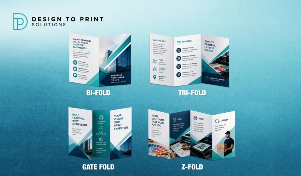
Before you write a word of copy or place a single image, a brochure asks you one structural question: how should it fold? The answer shapes everything else. It decides how many panels you have to work with, the order the reader discovers your message, whether the piece slips into a DL envelope, and how it feels in the hand.
Most Australian brochures come down to four folds: bi-fold, tri-fold, gate and Z-fold. Here is what each one is, when to reach for it, and how to set your artwork up so it prints the way you pictured.
First, a quick word on panels and sizing
A “panel” is one face of the brochure created by a fold. Panels are counted across both sides of the sheet, so a single fold gives you four panels, not two.
Australian print runs on ISO A-sizes rather than the US letter format, so the common starting sheets are A4 (210 x 297 mm) and A3 (297 x 420 mm). Fold an A4 into three and you get the classic DL brochure, roughly 99 x 210 mm, which is the size that fits a standard DL envelope and most brochure racks. That is why the tri-fold is the default in this country. When you see American guides quoting 8.5 x 11 inch sheets, mentally swap in A4 and you are on the right track.
Bi-fold (half-fold): the clean and simple option
A bi-fold is a single sheet folded once down the middle. One fold, four panels: a front and back cover, and two inside pages.
Because there is no fold running through the middle of each face, a bi-fold gives you large, uninterrupted panels. That makes it the friendliest fold for big photography, a bold single message, or a spread that needs to breathe. Fold an A4 in half and you get a compact A5 booklet feel; fold an A3 and you have a substantial A4-sized piece.
Best for: upscale restaurant menus, product or property showcases, corporate overviews, and any design that leans on strong imagery. If you have one big idea and want it to land, the bi-fold gives it room.
One thing to check: a bi-fold with large inside panels may be too wide for a standard brochure rack. If rack display matters, a tri-fold is safer.
Tri-fold: the Australian default
The tri-fold takes a sheet, divides it into thirds, and folds the outer panels inward. Two folds, six panels, three on each side.
This is the fold most people picture when they hear “brochure,” and for good reason. Folded from A4 down to DL, it fits envelopes, racks and a jacket pocket, and it gives you a natural reading path: the reader opens one panel, then the next, so you can build a message step by step. It is the standard for service overviews, event and travel information, and anything handed out at a counter or trade stand.
There is a technical catch worth knowing. In a tri-fold, the panel that tucks inside has to be slightly narrower than the other two, usually by a couple of millimetres, so it folds in cleanly without buckling. A good print template already accounts for this. Design without it and the fold can bulge or crease off-line.
Best for: service and product summaries, menus, event programs, real estate, and general marketing where you want a familiar, portable format. If you are unsure which fold to pick, start here.
For choosing the right paper stock and finish for a tri-fold that gets handled a lot, see our guide on coated versus uncoated paper.
Z-fold: same panels, different flow
A Z-fold also uses two folds and six panels, but the folds alternate direction so the sheet opens out in a zig-zag, like the letter Z. Unlike a tri-fold, the panels do not nest inside each other, so all six can be the same width and a design can run continuously across them.
That continuous spread is the Z-fold’s advantage. Because the reader can pull the whole thing open in one motion, it suits content with a clear left-to-right sequence: a timeline, a step-by-step process, or a map. It also lies flatter than a tri-fold when opened, which helps for anything the reader needs to scan at a glance. Z-folds are a popular choice for direct mail because they open cleanly out of an envelope.
Best for: step-by-step guides, timelines, instructions, maps, and direct mail pieces where sequence matters.
Gate fold: the dramatic reveal
A gate fold has two outer panels that open from the centre like a pair of doors, revealing a wide interior spread. When closed it looks like a standard brochure; when opened, the full inside is exposed at once.
That reveal is the whole point. The moment of opening creates a sense of occasion, which is why gate folds show up around product launches, premium invitations, and high-value client presentations. The large uninterrupted interior is ideal for a panoramic image or a single hero statement.
Gate folds cost more and ask more of the print process. The folding has to be precise so the two “doors” meet neatly in the middle, and heavier stock is often needed to hold the shape, which usually means the fold lines should be scored first to stop the paper cracking. Avoid running a single logo or line of text across the central seam, because the two panels will never align perfectly.
Best for: launches, premium invitations, and presentations where the opening itself should feel like an event.
Beyond the four main folds
The four above cover most brochure printing jobs, but a couple of others turn up when a leaflet needs more panels or a different reading rhythm. An accordion fold, also called a concertina fold, runs a series of parallel folds in alternating directions, giving you several even panels that fan open like the instrument it is named after. It suits detailed guides, event schedules and step sequences that run longer than a Z-fold can hold. A roll fold tucks each panel inside the next, so the sheet rolls up on itself, packing a lot of content into a small folded size, which is why product manuals and mini booklets often use it.
There is also the humble flat leaflet with no fold at all, still a strong option for a simple single-message flyer or pamphlet where folding would only get in the way.
A note on paper weight
The fold is only half the feel of a brochure. The paper does the rest. Brochure stock is measured in GSM (grams per square metre): the inside pages of a marketing brochure usually sit on a text-weight stock, while covers move up to a heavier card for pieces that need to feel substantial. A common trap is choosing a stock so heavy it fights the fold and cracks along the crease. Match the weight to the fold, and once you move above a certain thickness, have the fold lines scored so the crease stays clean. Your printer can recommend a suitable GSM for the fold and the job.
How to choose the right fold
Work backwards from three questions and the choice usually makes itself.
How much content do you have? A single strong message wants a bi-fold or gate fold with their big panels. A structured set of points wants the six panels of a tri-fold or Z-fold.
How will the reader receive it? Posted in a DL envelope or pulled from a rack points to a tri-fold or Z-fold. Handed over in person as a premium piece points to a bi-fold or gate fold.
What is the budget? A bi-fold or tri-fold is the economical, high-volume option. A gate fold, with its extra folding and heavier stock, sits at the premium end.
Setting up your file so it prints cleanly
The design is only half the job. Print-ready setup is what stops a good brochure arriving with text sliced off or falling on a fold.
- Start from the printer’s template. It has the correct panel widths, including that slightly narrower tuck-in panel on a tri-fold, plus fold and bleed guides already in place.
- Keep clear of the folds. Hold important text and logos back from fold lines so nothing important lands in a crease.
- Add bleed. Extend any colour or image that runs to the edge past the trim line, so trimming leaves no white slivers.
- Score heavier stock. Anything thick, and gate folds in particular, folds more cleanly and resists cracking when the fold lines are scored first.
- Supply a print-ready PDF. Fonts outlined, images high resolution, colours in CMYK. Our guide to print file formats explains why.
Design to Print Solutions produces folded brochures across all of these folds and can send you the correct template before you start designing, which removes most of the guesswork. If you are also planning flyers for the same campaign, our guide on choosing the right flyer size is a useful companion read.
Pick the fold first, design it to its panels, and your brochure will do the job it was made for. Request a quote when you are ready and let us know your fold, size and quantity.
Frequently asked questions
What is the most common brochure fold?
The tri-fold. Folded from A4 down to DL size it fits standard envelopes, racks and pockets, gives you six panels, and reads in a natural step-by-step order. If you are not sure what to choose, the tri-fold is the safe default.
How many panels does each fold have?
A bi-fold has four panels from one fold. Tri-fold and Z-fold each have six panels from two folds. A standard gate fold opens to reveal a wide interior from two outer panels that fold to the centre.
What is the difference between a tri-fold and a Z-fold?
Both have six panels, but a tri-fold folds inward so one panel tucks inside, while a Z-fold folds in alternating directions and opens flat in a zig-zag. Choose a tri-fold for a stepped reveal and a Z-fold for content that flows straight across, like a timeline.
What size is a DL brochure?
Roughly 99 x 210 mm, which is an A4 sheet folded into three. It is the standard Australian brochure size because it fits a DL envelope and most brochure racks.
Does heavier paper crack when folded?
It can. Thicker stock, and gate folds especially, should have the fold lines scored before folding to prevent cracking along the crease. Tell your printer the fold type and they will advise on stock and scoring.
Should I design my own brochure or use a template?
Always start from the printer’s template. It carries the exact panel widths, including the narrower tuck-in panel on a tri-fold, plus fold and bleed guides, so your artwork lands correctly once the piece is folded.
